- To: "Tom Whittaker" <whittaker@xxxxxxxx>
- Subject: Re: [idvusers] "Visible range" not showing image beneath
- From: "Dan Grey" <dangrey@xxxxxxxxx>
- Date: Mon, 21 Apr 2008 11:09:03 +0100
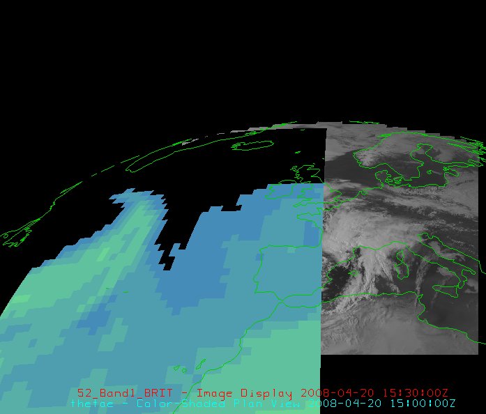
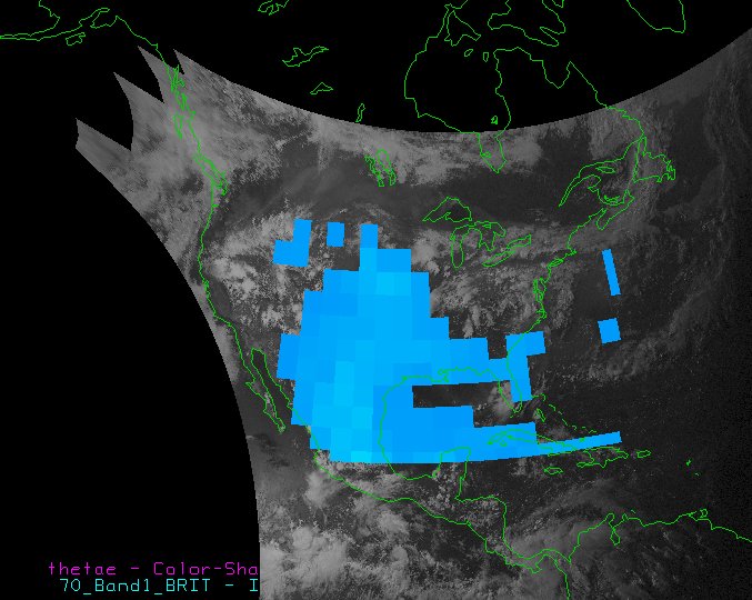
Hi Tom,

NB forgot to mention that I'm using v2.4.

The original method I was trying was selecting the "visible range"
check box beneath the colour table button on the Display tab of the
Dashboard, which un-greys-out the "Change" button next to it, and
using that button to change the visible range. No joy.

I tried your method but it fails in the same way as my original method
-- see attached pic.

Your example picture is exactly what I'm trying to achieve so I'm at a
loss as to why it's not working for me!

I do wonder if this problem is in some way tied to the sat pic I'm
using, which is a MSG image. It only displays if I use the "MSGT"
projection -- switching to a different projection, such as the
predefined Europe projection for a more top-down view, causes the
satellite picture to disappear (all the other displays remain).

To test that I recreated something similar to your example image
(using 2.5 deg data to save time, hence the blockiness!). Using my
original "visible range" method has the desired result (see second
attachment). I also tried your method, which also worked.

(BTW note the odd bug in the second image with the display list text
-- it's hidden behind the satpic. This again seems related to the
projection: I was using the predefined US CONUS projection. The
display list appeared normally using "World" or "North Pole".)


Dan


On 4/20/08, Tom Whittaker <whittaker@xxxxxxxx> wrote:
> Hi Dan --
>
>  I assume from your description that you tried to do a "change range"
>  on the theta-e plot.  In my example, the original range was
>  250-420K.....so perhaps you just tried changing the range to something
>  like 310-420K or something?
>
>  The behaviour of this is that it then treats all values from 250-309
>  as if there were equal to 310, for the purpose of mapping from the
>  data to the color table.
>
>  The way I know of to accomplish this is to edit the color table, click
>  on the "Transparency" radio button, set the transparency to 100%, and
>  then grab the slider above the "250" and drag it to the right (you
>  should see black/white checkboard pattern).  You will then get
>  something like the attached (I hope) image.
>
>  Hope that helps...
>
>  tom
>
>
>  On Sun, Apr 20, 2008 at 12:42 PM, Dan Grey <dangrey@xxxxxxxxx> wrote:
>  > I've got a sat pic (from a server under "Images") on the surface, and
>  >  a colour-shaded plot of theta-e at 850 hPa from the GFS above. I
>  >  restrict the visible range of the theta-e to a value so only areas
>  >  above a certain value are shown (to illustrate a plume event). However
>  >  areas with theta-e below my range appear black, rather than showing
>  >  through the sat pic below.
>  >
>  >  Am I missing something simple, is this is intended behaviour, or is it a
> bug?
>  >
>  >
>  >  Dan
Attachment:
satnthetae.jpg
Description: JPEG image
Attachment:
ussatnthetae.jpg
Description: JPEG image
- Follow-Ups:
- Re: [idvusers] "Visible range" not showing image beneath
- From: Tom Whittaker
- Re: [idvusers] "Visible range" not showing image beneath
- From: Don Murray
- Re: [idvusers] "Visible range" not showing image beneath
- References:
- [idvusers] "Visible range" not showing image beneath
- From: Dan Grey
- Re: [idvusers] "Visible range" not showing image beneath
- From: Tom Whittaker
- [idvusers] "Visible range" not showing image beneath